The last few years have raised a lot of questions about what type of news media people are consuming. Accusations are constantly being made about sources being false or the truth being obscured. Misinformation seems to be rife online, and arguments happen constantly on social media about what, and who, to believe.
So what is really going on? Are more and more people consuming biased (or even unreliable) news online? Is the situation as dire as some say it is?
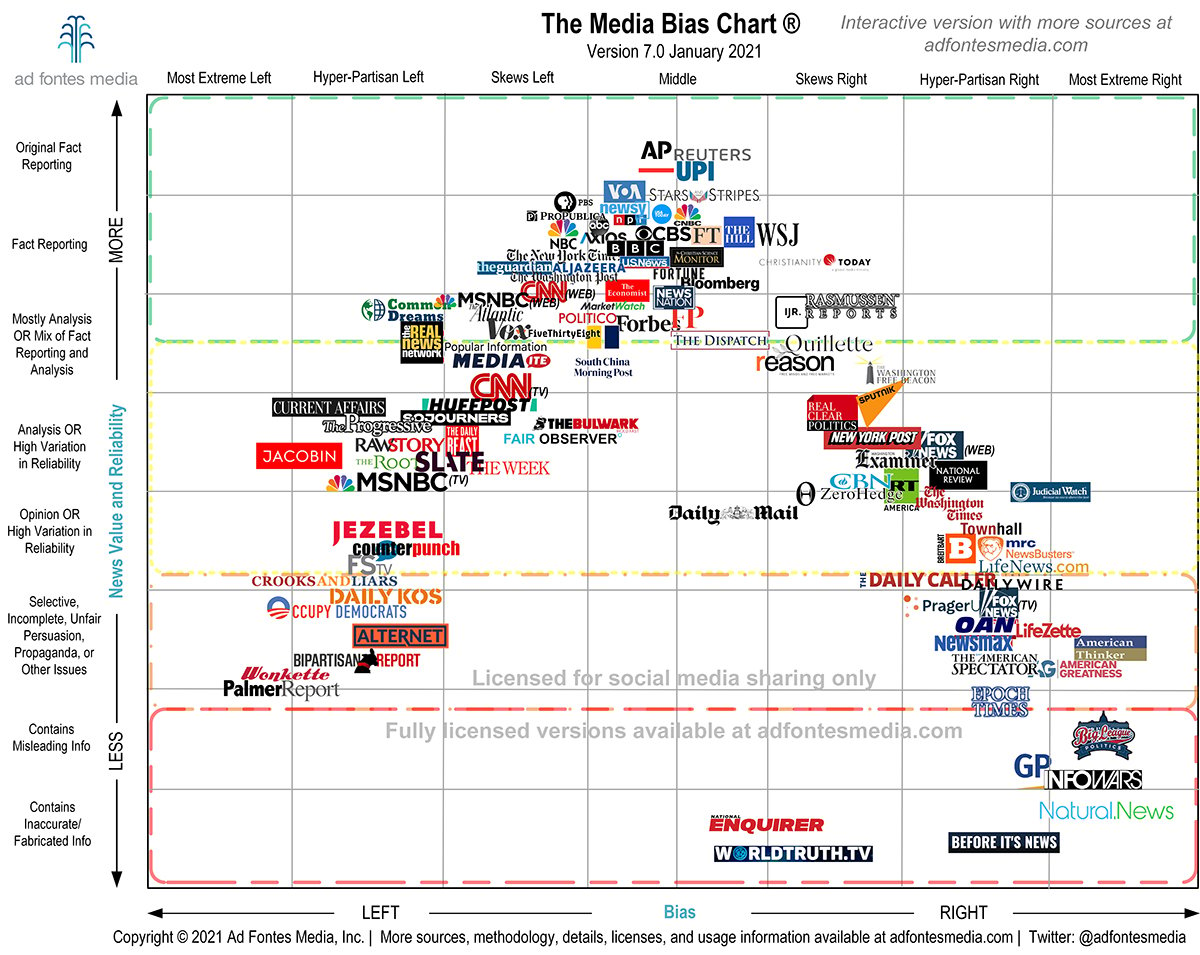
To find out, my team at Fractl partnered with Ad Fontes Media, the media bias intelligence company and creators of the Media Bias Chart, a data visualization that displays measures of news (and “news-like”) articles and sources. As you can see below, it plots each online media outlet in two dimensions: 1) news value/reliability on the vertical axis and 2) bias on the horizontal axis.
We took these bias and reliability measurements for each news site from their analysis and paired it with U.S. website traffic data from Semrush, an online visibility management SaaS platform and trusted data provider, to see how much traffic each news site was getting.
“The traditional role of the media was to tell the news yet we live in a time where we’re bombarded with opinion pieces, false theories, and fake news that spreads like wildfire,” said Laura Morelli, Head of US, UK, and Australian Media for Semrush.
“This leaves many consumers questioning: Can we really trust the media? Semrush data highlights that Americans are increasingly looking for answers when it comes to media bias. Over the past year, online searches for “What is media bias definition” skyrocketed 1,300%; meanwhile, people asking “Is there media bias” jumped 800%. More specifically, “Is our media biased” doubled in volume.”
Now we have some hard data: What news are people consuming online, and how accurate and unbiased is it?
Powerhouse News Sources
First, we took the flagship Media Bias Chart 7.0, which was released in January 2021, and overlaid it with Semrush’s traffic data. This view allows us to see which specific news sites are receiving high traffic numbers based on the size of their individual circles while also seeing how relatively reliable or unbiased they are.
Here is a glimpse of how 20 of the top online news sites with the most traffic compare against each other in terms of reliability and bias.
Note: The higher the reliability rating, the more reliable the site. If the bias rating is negative, it leans left. If it’s positive, it leans right. And scores closer to zero indicate that the site is either minimally biased, has a balance of biases, or has a centrist bias.
| Domain | Bias Rating | Reliability Rating | Average Traffic |
| washingtonpost.com | -8.38 | 42.25 | 272,402,440 |
| foxnews.com | 16.44 | 33.17 | 200,000,000 |
| nytimes.com | -8.6 | 46 | 195,722,018 |
| usatoday.com | -5.6 | 45.56 | 105,993,067 |
| npr.org | -4.85 | 47.93 | 77,044,457 |
| people.com | -7.13 | 43.89 | 73,014,683 |
| nypost.com | 14.04 | 34.73 | 71,487,399 |
| theguardian.com | -10.28 | 44.19 | 69,555,223 |
| nbcnews.com | -8.58 | 46.33 | 65,718,503 |
| huffpost.com | -13.68 | 35.76 | 49,972,898 |
Click here to view the raw data of the 223 sites we analyzed.
Vanessa Otero, founder of the Media Bias Chart and Ad Fontes Media, finds this overlay of the data fascinating:
“As one can notice, the highest volume of traffic is in two main clusters: The biggest cluster is in highly reliable but slightly left sources; the next biggest is lower and quite a bit to the right. But there is significant traffic in the middle reliability section on the hyper-partisan left side and also in the lower reliability section on the hyper-partisan left side.
“Notably, sources in the top right area and the low left area have very little traffic (in addition to there being fewer sources that land there overall, even though we scour the web for sources that would fall in those spots).
“This probably confirms most partisans’ existing beliefs. If you’re on the right, this likely validates your belief that the ‘mainstream media’ (i.e., that with the most traffic) is left-biased. If you are on the left, it likely validates your belief that right-leaning media tends to be lower reliability.
“It is easy to jump to conclusions that validate your beliefs about why traffic patterns look like this, but I would caution people not to be too sure about cause and effect.
“People on the left might reason that their news sources are better overall, and that right-leaning folks are attracted to lower quality news. But people on the right might just as easily reason that people on the left are satisfied with the confirmation bias they receive from mainstream sources, which would reduce the demand for hyper-partisan, lower quality left sources. The fact that mainstream sources are left-biased could have created the desire for highly partisan right leaning media that explicitly exists to fight back.
“Alternatively, people could assume our evaluations themselves are biased (details on our methodology here).
“No matter what people’s political leanings, the most troublesome part is the wide gap in bias between the most popular news source, which reflects the stark polarization we are experiencing in America.
“The graph showing the change in traffic over time, broken out by the reliability scores, shows something striking around the end of 2020 and beginning of 2021, the period right after the presidential election. Traffic to both “slightly reliable” (i.e., problematic) and “not reliable” sources spiked, which indicates that people gravitated toward “news sources” that told them what they wanted to hear even if those things weren’t true.
“Notably, the graph of source broken out by bias shows that over the same period of time, traffic to hyper-partisan right sites spiked while traffic to hyper-partisan left sites declined.”
How Online News Consumption Has Changed Over Time
Our next step in getting a broader view of the topic was exploring how online news consumption may have changed over time. So we pulled data starting from January 2018 to look for any trends.
Changes in Reliable Media Consumption Over Time
.png)
The first point of interest is the changes in traffic to unreliable news sites. To contextualize this line, though, let’s remember there isn’t as much volume of traffic as the other categories, which can account for the more dramatic variations.
We were curious to see that after a progressive incline of nearly all the lines starting in mid-2019 that there was a significant dip on the “not reliable” line around October of 2020, right before the U.S. Presidential Election. Perhaps people turned to more reliable sources during this high-anxiety time?
There also appears to be a correlation between this dip and social media platforms tightening their content restrictions, like Twitter’s updated warning labels, designed to show less information on the site.
Other dips across the board are hard to pin down, though it’s certainly interesting to see that “slightly reliable” websites, as opposed to “mostly reliable” or “extremely reliable,” earn the most traffic increases relative to the baseline.
Changes in Biased Media Consumption Over Time
.png)
These percent changes from the baseline are drastic. We can clearly see a decline in hyper-partisan left media traffic changes juxtaposed with a general increase in hyper-partisan right media traffic changes.
As of January 2021, hyper-partisan right media has had the highest increase in traffic from its baseline compared to the other types.
“We believe the world has a real need for authoritative and independent arbiters of fact,” Morelli said.
“There is good reason for it, too. Ground-breaking stories and insights lurk in the detail of data. While the online world and growing onslaught of tech may have thrown at us misinformation and biased information sources, it has also opened up new ways of accessing insight – including sourcing up-to-the-minute perspectives on popular opinion and widespread sentiment, and the ability to identify trends through aggregated online search behavior.”
It’s important to be aware of the value of data-based, reliable, unbiased news sources and do our best to filter out the publications that aren’t well vetted or objective.
Conclusion
It’s meta to say this, but don’t take any claims about the accuracy or bias of the media at face value without looking at the data. Here we can see some clear pictures of what’s actually happening, and there’s certainly still significant room for improvement in terms of centering objective, accurate news sources.
Methodology and Fair Use Statement
This report examined data for 223 web publications between February 1, 2018 and February 28, 2021. Volume traffic data was compiled and calculated by Semrush and was reported as a monthly total, which represents an estimate of total website traffic to a domain, its subdomains, and its subfolders. These data were explored in conjunction with bias and reliability ratings provided by Ad Fontes (see here for a detailed explanation of the Ad Fontes methodology regarding bias and reliability ratings of online news organizations). In the interactive visualization, monthly traffic estimates are reported as total volume, whereas the two charts exploring changes over time represent volume changes as a percentage of February 2018 levels (note that percentage changes are relative within-category only and do not necessarily correlate with patterns in overall traffic volume across several sites).
If citing or referencing written or visual aspects of this piece, please be sure to include a link back to this page in order to ensure proper attribution.